Letters Before Laughter: The Hand-Painted Genius of British Cartoon Title Cards
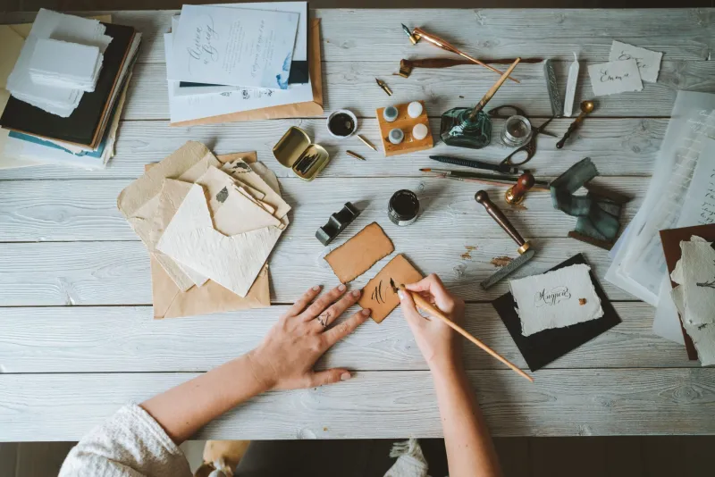
Somewhere between the last ad break and the first proper frame of animation, British telly used to hand us a miniature exhibition. A painted logo. A wonky bit of lettering. A background that looked like it had been made by someone with a steady hand, a pot of Poster Paint and a deeply personal relationship with a rostrum camera. We watched it for eleven seconds, then forgot about it for forty years. Except we didn’t really, did we?
Here at Cartoon Me, we spend a lot of time arguing about characters, voices and whether a cartoon’s tea says anything about its moral compass. But the title card is the thing. It is the handshake before the cartoon lets you in. And in 2026, when so much of our viewing begins with a thumbnail and a “skip intro” button, it feels worth celebrating the people who made those opening frames feel like an event.
The bit we fast-forwarded past (and shouldn’t have)
A good British cartoon title card does several jobs at once. It tells you what you are about to watch. It sets the mood. It often tells you, in bold painted letters, that this is a programme with personality, thank you very much. Think of the handmade wobble of a Roobarb-style logo, the chunky confidence of a Cosgrove Hall opener, the warm storybook lettering that made so many British animations feel like a nursery tale with a sly wink.
These were not throwaway frames. They were designed. Someone chose the typeface — or, more likely, painted the typeface by hand because a Letraset sheet had gone missing and the deadline was Thursday. Someone mixed the colours. Someone decided that the title should sit slightly off-centre, or that the letter O should have a little face, or that the whole thing should look like it had been discovered in a dusty attic and given a good dusting for telly.
That is graphic design doing quiet, enormous work. It is also why the title sequence often outlives the plot. I can hum the opening of cartoons whose episodes I could not summarise under oath. That is not a failure of memory. That is the title card doing its job.
The craft behind the wobble
The British cartoon title card sits at a lovely crossroads between illustration, typography and low-budget improvisation. Studios such as Halas & Batchelor, TVC, FilmFair, Cosgrove Hall, Aardman and Siriol all worked in different registers, but the best of their opening graphics share a certain physicality. You can often sense the paper, the paint, the cel, the card, the letraset, the airbrush, the slightly wonky registration.
That is not nostalgia talking. It is craft. Hand-painted lettering has a pulse. A painted title can be slightly uneven, and that unevenness is the point. It feels made rather than generated. A logo might look as if it has been cut out and stuck down, because it probably was. A title sequence might use simple silhouettes, bold blocks of colour and one very confident piece of lettering, because that was what the budget and the imagination allowed.
And the names behind that work? Often they are not the names on the front of the VHS box. The designer, the letterer, the background artist, the rostrum camera operator, the person who painted the title card at half past nine on a Friday — these are the supporting cast of British animation. They are the reason a cartoon feels like itself before a single character has spoken. That is an artist spotlight worth shining.
Studios, letterers and the names you never see
We love a creator credit. We also love the invisible gang. In British animation, title design was often folded into the wider art department, which means the person who gave a show its opening identity might also have been painting backgrounds, designing props or making sure the villain’s castle had the right amount of ominous purple.
That collaborative, slightly scrappy tradition is part of the charm. A Cosgrove Hall opening might feel like a little Gothic theatre. An Aardman title might feel like a shed full of clever people with Plasticine under their fingernails. A FilmFair adaptation might open like a storybook you could almost smell. None of that happens by accident. It happens because someone thought hard about shape, colour and the way a title sits on the screen.
And let us spare a thought for the lettering. British cartoon lettering is its own glorious sub-genre: fat friendly capitals, spidery storybook script, letters that lean like they have had a pint, letters that look bitten rather than drawn. It is typography with a grin on. In an age of neutered streaming interfaces, that grin is sorely missed.
What streaming thumbnails can’t do
A thumbnail is a shop window. A title sequence is a curtain-up. That is the difference. Streaming platforms are very good at telling us what to watch next, but they are not especially interested in giving us a proper overture. The thumbnail wants to sell you a show. The title card wants to welcome you into one.
When a title sequence is reduced to a corner of the screen, or skipped entirely, we lose a small ritual. We lose the moment where the cartoon clears its throat. We lose the hand-painted lettering that told us this was going to be a bit special. We lose the chance to see the art department have a proper go.
That is not just a grumble about modern telly. It is a plea for preservation. Title cards are part of the archive. They are miniature works of art that happen to have been broadcast between a trailer for a washing powder and an episode about a talking mouse. They deserve to be looked at properly, not just remembered through a fuzzy screenshot on a forum.
A modest 2026 plea
So here is the Cartoon Me manifesto for title-card appreciation in 2026. Watch the opening. Let it play. Notice the lettering. Notice the painted background. Notice the way the logo wobbles. If you are lucky enough to have a DVD or a Blu-ray with the original titles intact, treat it like the little gallery it is.
And if you make cartoons yourself, please do not let the title card become an afterthought. Give us a proper handshake. Give us a wonky logo with a bit of soul. Give us a title sequence that makes a eight-year-old put down the remote and a forty-eight-year-old say, “Oh, I’d forgotten that.” The plot is important, obviously. But the title card is the thing.